Tag Archives: Fountain Pen

New Pen!! The Edison Pen Co ‘Mina’, aka Unicorn Barf

I was lucky enough to visit the 2015 DC Pen Show this year. Billed as “the largest pen event in the world’, attending the show was an amazing and unforgettable experience for a still-new pen enthusiast like me. I got to meet the great people behind the names that I buy from all the time – Brian and Rachel Goulet from GouletPens, Brian and Lisa Anderson from Anderson Pens, Brad and Jeff from NockCo …. and SOOOO MANY great friends from the pen community online.

Just imagine walking through a room FULL of tables of pens, paper, ink, and other goodies (click to enlarge!)

 wpid-img_20150814_141914.jpg     wpid-img_20150815_131709.jpg

wpid-img_20150814_181525.jpg      wpid-img_20150815_140748.jpg

So we are wandering by all the tables, having resolved – learning from newbie mistakes made last year at the Colorado Pen Show – not to jump on the first pen we fall in love with, but to make the circuit and see everything that is available. Perfectly logical and reasonable, right? I’d even spotted this TARDISy blue beauty made by Shawn Newton, and managed to drag myself away, BUT JUST BARELY.

wpid-img_20150815_131050.jpg

Newton Pens Beauty

So THEN we come to the Edison Pens table. Just like Newton Pens, Scriptorium Pens, Ken Cavers, or the Carolina Pen Company (to name a few of the big names), Edison Pens makes custom fountain pens. I’d not had a custom handmade pen on my pen show wish list, as they usually tend to be at a higher price point. But we were walking by the Edison table full of gorgeously colorful pens like these:

wpid-img_20150814_142903.jpg

wpid-img_20150814_143425.jpg

wpid-img_20150815_132615.jpg

wpid-img_20150815_132714.jpg

We started talking to Brian and Andrea Gray from Edison Pens, two of the nicest people I’d met at the entire show, and SO accommodating and informative about their pens and available options, discussing the show and our impressions so far. When I saw IT. A clipless streamlined beauty in a turquoise and pink swirl pattern called “Hawaiian Swirl”. And it was on the side of the pen display I could afford haha – the prices got higher as you went from left to right on the display.

I saw this pen and instantly thought of the Nock Co Brasstown case I’d just bought a few moments earlier in the pink/sky blue colorway. An Instagram user (@dirgesinthedark) had coined the term “unicorn barf” when referring to this colorway because it is so cotton candy awesome. And when I saw the pen in question, I turned to my husband and was all, “oh look, it’s the unicorn barf pen!” Which made Brian Gray laugh and go, “I’ve not heard it called that before!” and post a photo on Instagram.

wpid-screenshot_2015-09-06-20-56-49-1.png

(It was so funny to hear people recognize and call it the Unicorn Barf pen when I talked about it later!) Brian proceeded to tell us that Andrea had picked out the Hawaiian Swirl pattern as a trial run, and they weren’t sure how popular it would be so only made three pens out of the material to bring to the DC Pen Show. As soon as I held the pen that had caught my eye, the “Mina” model, I was hooked and had to have it. So here she is, my first ever custom pen in all her “unicorn barfy” glory! (I didn’t even know it was the Mina until later when people started asking what it was, and I was all, “I dunno”. I swear it’s the least informed I’ve ever been about anything pen-related I’ve bought so far. It was all instinct, giving into the ZOMG MUST BUY NOW impulse. Some nice IG friends were able to answer the questions I couldn’t haha).

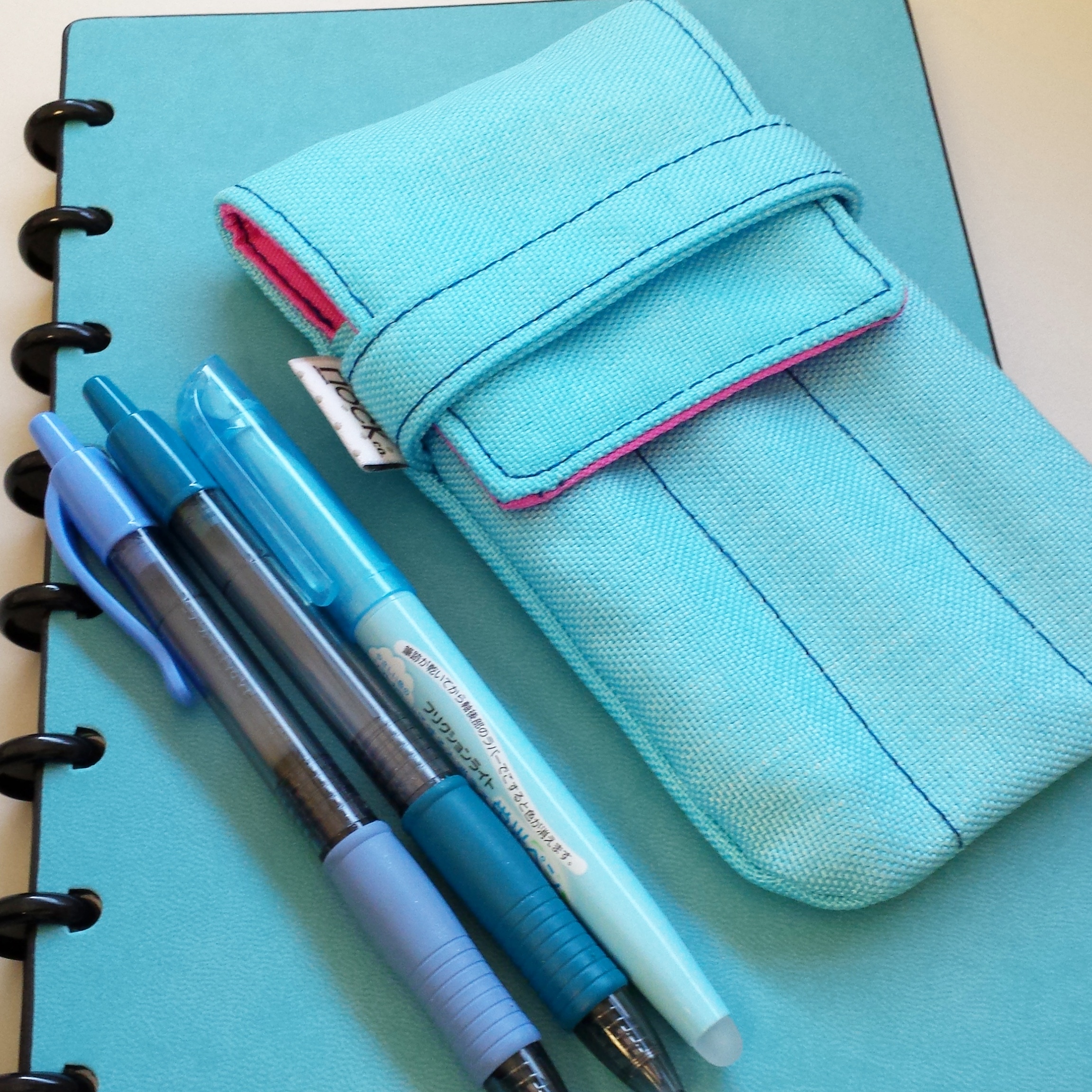
Shown here with the other NockCo cases I’d brought to the show with me (in the same colorway of course):

wpid-img_20150814_150213.jpg

wpid-img_20150814_150513.jpg

I was seriously tempted by my first gold nib too, and would have walked away with one had they not been two-toned, silver with gold. Which ….. NO. This pen was almost sculptural, gold just wouldn’t work. The Grays generously offered to mail me an all-silver gold nib, and send the pen home with a steel nib temporarily. But as soon as I wrote with the 1.1 steel nib, I was hooked. It was so buttery smooth! And the Edison pen nibs are replaceable should I want to change it out for something later.

I’d bought a bottle of J. Herbin Larmes de Cassis earlier at the show, and it is a PERFECT fit for this pen. Who are we kidding, I had it inked up before even leaving the show for the day.

wpid-img_20150820_154841.jpg

I later learned that Edison Pens does have an agreement with Richard Binder through Indy-Pen-Dance to add flex capability to gold nibs. Which would have been awesome! I wish I’d known at the time I was there at the table, maybe they’d have had one to play with. But as I later learned through emails with Brian Gray, the flex gold nibs are in the #6 nib size only, and the Mina pen I’d chosen used a #5 nib. As we joked, all the more reason to get a future pen from him now!!

But seriously, this ink is a perfect match for this pen.

wpid-img_20150823_161732.jpg

First impressions. There is nothing to keep this pen from rolling off your desk! The cap is a screw cap, which … I personally prefer magnet caps for most everything, they are so much easier to use one handed! But sometimes you make allowances for special pens haha.

Pen posing while at breakfast. Here you can get a good idea of the Edison Mina‘s shape, tapering out at the ends and narrowing in the middle. This is the standard length Mina – there is also an extended version available.

wpid-img_20150818_103528.jpg

Length-wise it’s just about as long as a Lamy Safari.

wpid-img_20150816_121438.jpg

Do you see the sparklies in this material?? The quality and craftsmanship is really evident as you hold this pen. It’s lightweight and well-balanced – I don’t miss being able to post the cap. Okay, well maybe a little, but the pen looks so attractive otherwise I’ll make an exception.

wpid-img_20150816_115646.jpg

Even 3 weeks later, the pen love still hasn’t worn off. I take pics of this pen every chance I get. Weekends at breakfast…

wpid-img_20150829_110035.jpg

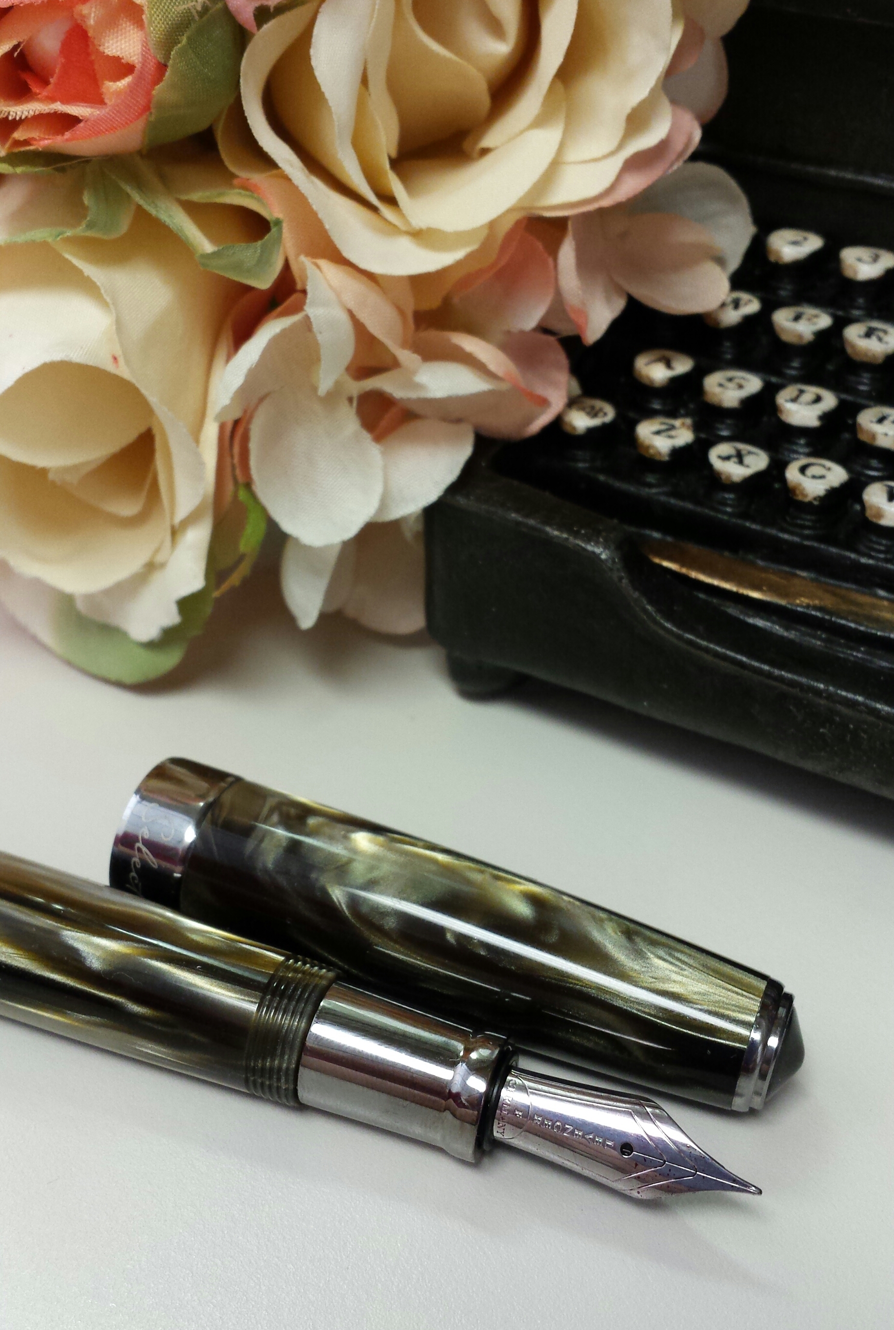
Even on color charts. This pic has a good view of the nib and grip section.

wpid-img_20150905_154839.jpg

I was also lucky enough to meet and chat with the other two customers who bought pens in the Hawaiian Swirl pattern! Check out their pics of their pen show beauties, which they’ve given me permission to repost here.

@pinkinkfountainpen bought the Edison Pearlette:

wpid-screenshot_2015-09-05-23-53-18-1.png

@garrily bought the Edison Beaumont:

wpid-screenshot_2015-09-05-23-52-52-1.png

We’ve joked we may need to come up with a good Unicorn Barf club name now!

But I’ve really been impressed with my first custom fountain pen, and have really been bitten by the bug now. Just gotta save up for my future flex nib pen next!!

NockCo Pen Cases

Get involved in the fountain pen community long enough and you hear about the pen cases sold by Nock Co. Made of brightly-colored fabric and in varying models, these cases are a fun, casual way to hold your favorite pens. Photos are often posted under the hashtag #nockshots.

The first case I bought was the Sassafras – The Five Pen Bi-Fold, in the Sky Blue/Pink colorway. I wanted something that would hold a few pens. I knew the pen case didn’t have any kind of closure, but decided to try it anyways. The outside is a pretty light blue, textured fabric. The quality and craftsmanship is impressive.

wpid-img_20150427_190307.jpg

wpid-img_20150429_102125.jpg

Inside is a hot pink smoother fabric.

wpid-img_20150427_191403.jpg

But while the case was great, and actually stayed closed surprisingly well, I still missed a closure of some kind. So was drawn to the Lookout – Three Pen Holster. Which had a strap to keep the top flap closed. Also in the same colorway. I love it! The only downside is it doesn’t hold as many pens. And whereas with the Sassafras I could fit two pens in each slot generally, the Lookout is narrower, making that impossible.

wpid-img_20150619_153746.jpg

wpid-img_20150619_154956.jpg

wpid-img_20150710_095717.jpg

And I just love the color!

wpid-img_20150710_095518.jpg

wpid-img_20150623_094143.jpg

Update – I added the Brasstown Zip Roll-Up case at the DC Pen Show this August. Guess what colorway? It’s amazing, you can fit so many pens in it!! And even MORE when you use the clips to hold them onto the sleeve pockets.

wpid-img_20150831_102833.jpg

wpid-img_20150825_100330.jpg

It’s here! The new 2015 Lamy Safari Neon Lime

I got it, I got it!!

I’ve been on the fence about whether to get this 2015 LE Neon Lime fountain pen or not, given how it’s a nearly identical color to 2013’s Neon Yellow. Ultimately I decided to buy it, partly because I was curious, partly because any new pen is a good pen (WOOOOOOOOO!), and partly because I’ve learned over my 7 years of collecting these Lamy Safaris that even if I don’t want it now, I might regret not getting it in the future.

It’s a sign of how unexcited I was for this color that I didn’t even order from a UK company first (the pen is available in Europe a few months before it arrives in the US). Away to the lovely Goulet Pens I went, and ordered a F nib. That’s my default nib because it is pretty much perfect, and I have all the other nib sizes should I want to switch.

image

While Lamy also released a LE Neon Lime ink as well, preliminary reviews show it to be so light and hideously bright that it’s illegible, and is really suited more as a highlighter ink. So, pass! Instead, I took the opportunity to order some green samples I’ve had my eye on: J. Herbin Vert Olive and R&K Alt-Goldgrun (I also wanted more J. Herbin Larmes de Cassis to try before ordering a full bottle, it’s a gorgeous purple).

I’ve only inked up J. Herbin Vert Olive so far. It’s very light, but does try a bit darker to make for easier reading. Still conflicted about it – I love the color, but it might need to be in a broader nib for everyday use!  Perhaps the Noodlers Ahab.

image

image

As I started using the pen, the Neon Lime became an increasingly elusive color to nail down. In some lighting it would be a clear green. In other lights it would be hard to tell apart from the Neon Yellow.

image

image

I then staged some comparison shots, comparing the new Lamy Neon Lime to my other Safaris. In this pic from left to right, Yellow (regular production line color), Neon Yellow (2013 LE), Neon Lime (2015 LE), Lime (2008 LE), and Apple Green (2012 LE).

image

image

image

I even took a pic in full sunlight, which made it even harder to tell the Neon Lime (middle right) from the Neon Yellow (middle left).

image

Final thoughts? I like it, I’m glad I added it to the collection. But the 2015 LE Neon Lime isn’t an immediate favorite, like the 2015 LE Copper Orange Al-Star is, or the 2014 LE Neon Coral immediately became. It probably won’t see frequent rotation, as with the Neon Yellow, but I’ll pull it out occasionally and enjoy the pop of Neon happiness it provides.

image

Real Life Pics of the 2015 Lamy Safari Neon Lime!

Thanks to StupidityVaccine on Imgur, check out this comparison of the 2015 Neon Lime to the Neon Yellow! FINALLY, real pics!

Review: Levenger True Writer Select Fountain Pen

As many of my repeat visitors know, I post about my Levenger stuffs often. Like A LOT a lot. I’ve been a diehard user of the Circa notebook system for 7 years now, so am always trying out new pages and covers and discs. But surprisingly, while I’ve read a bunch about their fountain pens, my only exposure to their pens has been the Levenger L-Tech I bought for my husband a couple of years ago. So when Levenger contacted me and asked if I wanted to review a fountain pen here on my blog, this was pretty much my exact reaction:

Yeah, I was THAT excited.

So of course I said YES! They sent me a True Writer Select fountain pen with a Fine nib, and TWO bottles of ink in Cobalt and Shiraz!!! This was a most-welcome surprise, as I’ve never tried any Levenger ink either. Reviews of the ink colors will come later, but for now, let’s take a look at this gorgeous new pen I have to play with.

The True Writer Select comes in Mediterranean (ocean blue), Stormy Weather (light grey), and Macchiato (coffee brownish). If you want to read some reviews of the Mediterranean colored pen, check out  Pen Habit and Pen Addict for some fabulous close-up pics.

Anyhoo, I was given the choice of colors to review. I normally don’t do brown pens at all, as I’m very much into bright colors. Which is a big reason I haven’t tried True Writers up until now, the colors tend to be very conservative and traditional. But since I am 100% in love with all things coffee (except chocolate covered espresso beans, because GROSS), Macchiato seemed like a slam dunk. How can a pen that looks like this go wrong??

When he saw the pen Levenger was sending me, the husband was all, “Oooh, if you don’t like it I’ll totally take it off your hands” – psh, fat chance of that Mister!

The Packaging:

I was already impressed with the packaging on the L-Tech, but hoooo boy! The True Writer Select has some pretty epic nesting-box awesomeness going on. I felt like I was cracking into a sarcophagus just trying to get to the pen.

First was a white cardboard sleeve:

wpid-20150220_163237-1.jpg

Next up, a grey box with Levenger printed in silver on the top:

wpid-2015-02-23-12.58.04.jpg.jpeg

The lid to this box came off to reveal a canvas mesh wrapped second box:

wpid-20150220_163621-1.jpg

Once you unwrapped the canvas-like material from the inner box, you saw that it is a nice felt-bottomed wooden display box – it has some impressive heft to it. When opened, the rim of the box is trimmed in a light wood that unfortunately didn’t capture well no matter how I tried with my lighting and camera. But let’s be honest – I only had eyes for the pen anyways! It also came with a standard twist-style converter and one standard international-sized (1/5″) ink cartridge.

wpid-20150220_163726-1.jpg

Which leads us into …..

The Color:

At first glance, I was all, what the heck? This isn’t coffee colored!? But as I turned it around under various lights, I came to realize the Macchiato color is actually very chameleon-like. In some lighting the swirls appear almost yellow-green or grey-brownish. My first thought was it was almost more of a mink/fur-coat color.

wpid-20150220_125303-1.jpg

Levenger True Writer Select in Macchiato

Levenger True Writer Select in Machiatto

Levenger True Writer Select in Macchiato

In other lights, it appears brown.

wpid-2015-02-23-11.32.10.jpg.jpeg

Levenger True Writer Select in Macchiato

wpid-20150220_163447-1.jpg

Levenger True Writer Select in Macchiato

As you can see, the swirls are a very elusive color and difficult to photograph. If you ever had Tiger’s Eye polished rocks as a kid …

The pen is somewhat like those rocks in person, in that you can’t keep from turning it around in your hand to watch the resin swirls change. But it’s definitely not exactly the coffee/caramel brown I was expecting.

wpid-20150223_135143-1.jpg

Levenger True Writer Select in Macchiato

Looks really brown in this pic!

wpid-20150223_111224-1.jpg

Levenger True Writer Select in Macchiato

The Size:

At first glance, this pen is HUGE. Both in length and width. But it is surprisingly lightweight, especially in comparison to the hefty L-Tech. Here are some (not-so-super-scientific) measurements and weights:

wpid-2015-02-23-11.27.08.jpg.jpeg

Fountain Pen Size Comparisons

Pen  –  Length  –  Weight:
Lamy Studio (Royal Red)  –  13.7 cm  –  33g
Monteverde Invincia (Stealth)  – 13.9 cm  – 41g
Levenger L-Tech (Stealth)  – 13.6 cm  – 49g
Rebecca Moss Mystery Pen  – 14 cm  – 47g
Lamy Al-Star (2015 LE Copper Orange)  – 13.7 cm  – 21g
Levenger True Writer Select (Machiatto)  –  15 cm  – 37g
Monteverde Artista (Purple)  – 12.7 cm  – 25g

As mentioned above, the True Writer Select is surprisingly comfortable to hold for such a huge pen. When posted it feels a little unbalanced, too heavy towards the bottom. Here it is shown next to the L-Tech, both pens posted.

wpid-2015-02-23-11.20.58.jpg.jpeg

Levenger True Writer Select in Macchiato and Levenger L-Tech

The End Thingies:

I can’t tell if the end thingies (yep, that’s my technical term) are black or just dark brown. But the top one is pointed ever so slightly. The clip is unobtrusive and I haven’t had any issues with it. And that’s about all I have to say about any of them.

wpid-2015-02-23-11.59.15.jpg.jpeg

wpid-2015-02-23-12.00.59.jpg.jpeg

The Cap Trim:

The pen has a screw-on cap. One side says ‘LEVENGER’ and the other ‘Select’. I like the script font that is used for the Select side, it adds an elegant touch to the pen.

wpid-2015-02-23-11.56.36.jpg.jpeg

wpid-20150223_115431-1.jpg

The Nib:

As I mentioned earlier, my only experience with Levenger nibs has been with Medium and Fine nibs on the L-Tech. The Medium nib I thought was butter-smooth but way too wide for my tastes. My husband ended up ordering a Fine nib separately because it was too wide for his tiny writing style as well – SIDEBAR: can I just say I LOVE pens that let you order the nibs separately!? It’s so convenient to have that option, rather than buying a whole new pen.  When he got the new F nib I was impressed with how it wrote, but was still a little put off by the weight of the pen – especially after my lightweight Lamys) –  so didn’t really play with it much. But I’ve also been conflicted about my everyday pen carries lately, as I like fine nibs for writing, but want the broader nibs that really let the ink color shine more too.

In this case, practicality won out and I went with a Fine nib. Levenger sent this pen along with a note stating that they were interested to hear what I thought of the F nib, as it was somewhat different from their other nibs. In appearances it does look pretty different. The True Writer nib is larger, with different pattern etched into the steel, and a round hole missing from the L-Tech nibs.

wpid-20150223_110731-1-1.jpg

Levenger L-Tech M, True Writer Select F, and L-Tech F nibs.

wpid-2015-02-23-11.24.24.jpg.jpeg

Levenger L-Tech M, True Writer Select F, and L-Tech F nibs.

More importantly, I inked it up right away with some of the new Levenger Shiraz ink, and it wrote perfectly right out of the box! Smooth, always starts up, a fine but not needle-fine line. No squeakiness, scratchiness, or other complaints. Here is a comparison to some Lamy pens (which tend to write wider lines than most):

wpid-2015-02-23-11.22.08.jpg.jpeg

I think the Levenger F nib actually writes a finer line than the Lamy F. The F nib on the True Writer Select also looks a teensy bit finer than the L-Tech, but that could just be a factor of the inks as well.

wpid-2015-02-23-11.19.00.jpg.jpeg

I REALLY enjoy writing with this nib. It’s just ridiculously smooth.

Conclusions:

I’ve been using the Levenger True Writer Select for a few days now and really like this pen. My fingers tend to slide down the grip a little, but I think that’s the nature of the polished metal grip section more than anything – I’ve been using Lamys so long I need to get used to metal again! It is larger than most pens, and this might be slightly off-putting to those with smaller hands, but I’ve surprised with how well I adapted to it. I think I’d have preferred to see a magnetic cap too, but that’s a minor critique.

One complaint I’ve read in other reviews and noticed when using this pen as well: the pen barrel does tend to unscrew itself ever so slightly from the feed with frequent use. I’ll go to uncap the pen, and have to give the barrel a few twists to get it back to where it should be. It’s not a deal-breaker, but something to be aware of. The husband says his L-Tech does that to him fairly often too.

Price wise, with a retail value of $169 this pen is definitely not an entry-level fountain pen – although the accountant in me has to wonder how much of that cost goes into the elaborate packaging. Fancy packaging to me is somewhat of a waste – I can’t bring myself to get rid of it, so put the boxes away in a closet and never use or display them again. But again, that’s the practical side of me coming out. Levenger is playing up the gift-giving side of pens, promoting that the box the pen comes in can be engraved. And as any customer of Levenger knows, their items are priced at a premium and people have come to expect fancy packaging that the company is known for. And this pen is definitely marketed towards someone who already knows fountain pens and perhaps wants to upgrade to a nicer pen or expand their collection. Or who just wants to treat themselves.

(Just add FOUNTAIN PENS to the above meme haha. Also, I may have been binge-watching Parks and Rec this weekend.)

And besides, Levenger regularly has sales and coupons where the pen is available for a good $35 less or more, often with free shipping. And its about on target market-wise with its competitors. I recently got a Visconti Van Gogh Portrait in Blue, and it was of similar construction, materials, and price point. The Levenger steel F nib actually writes better than the steel Visconti F nib, which I thought was very nail like and almost too fine, whereas the Levenger F nib I took immediately to and can’t recommend highly enough.

All in all the True Writer Select is a solid, attractive fountain pen, and I seriously don’t know why I waited so long to get one! Many many thanks to Levenger who provided me this pen to review. My husband SO isn’t getting this pen, that’s for sure!

wpid-20150223_111110-1.jpg

Levenger True Writer Select in Macchiato

IT’S HERE!!! The 2015 Lamy Al-Star Copper Orange.

And it is GORGEOUS!!! I pre-ordered it from The Writing Desk UK, who I’ve purchased limited edition Lamys from in the past when I was too impatient for them to get released in the US. They have affordable prices and reasonably quick shipping to the US. And I just received this new Precioussss in my mailbox last night!!! Read on for some pics of this luscious pen in it’s full glorious coppery glory!

First of all, the pen came well packaged from The Writing Desk. Surprisingly, the pen came double boxed. Usually, Lamy pens have come to me two ways: 1) in the “slotted” gray cardboard box, with the pen clipped to a cardboard sleeve inside, or (which I’ve seen much less often) 2) in a plastic/vinyl pouch. This time, the pen came in a slim gray box packaged inside the normal gray slotted box, as shown below.

image

And then the color pops out and embraces your eyeballs! What a beautiful glowing shiny copper color.

image

The feed is the standard Al-Star smoky feed (compared against the 2009 LE Lamy Safari Orange just for the heck of it):

image

The nib is the trusty Lamy workhorse Fine, if you’ve used Lamys before you know while EF nibs can be tricky, the F nibs are almost universally good smooth writers.

Along with the new 2015 Copper Orange Al-Star, Lamy also released a new limited edition Copper Orange ink in both bottled and cartridge forms. The Writing Desk didn’t have them available when I pre-ordered my pen, so I’ll just pick it up later when it’s more available here in the U. S. In the meantime, I popped a Lamy Violet cartridge in to test it out. It’s a fun contrast to the orange!

image

Next, because comparisons are always useful! The new 2015 Al-Star vs the 2014 Lamy Safari Neon Coral and 2009 Orange limited editions. First, the yummy yummy color – just looking at this makes me incredibly happy:

image

And full-length side by side view:

image

The caps:

image

The bottoms:

image

Conclusions: I adore this new pen. The shiny metal aluminum finish really adds a special warm glow to this copper color that instantly made it a new favorite.

If you’ve used Lamy Al-Star fountain pens before, it’s exactly as you’d expect in terms of performance and reliability. Yes, these Al-Stars are a little more prone to scratches in the aluminum finish as compared to the ultra-durable Safari plastic. But I’m used to that, some scratches from everyday use – at least in my case – are inevitable really. If I was worried I’d put it in a roll up case that protects each pen individually, but that probably won’t happen. My pens are well-loved and well-used.

Regardless, if you’ve been on the fence about this pen, go get it as soon as it comes available – you won’t regret it!! It will be in high demand once discontinued, just like the Orange Safari is now.

Now for more pics, but this time with GLITTER.

image

image

kmpn.blogspot.com – Real pics of the Lamy Al-Star Copper Orange

It is SO BEAUTIFUL. AND COPPER. AND ORANGE. This glorious pic was taken by kmpn.blogspot.com – check out their blog post for more.

image

Limited Edition 2015 Lamy Al-Star Copper – More Pics to Drool Over!!

Real-world pics of the droolworthy 2015 Copper Al-Star, thanks to Appelboom Pens‘ Instagram post!! Seriously, how AWESOME does this color look!?

Another pic from @mishka5050 on Instagram:
image

And from @BureauDirect on Instagram:
image

OMG I SO WANT ONE! Some other fun pics I found online:

Source: Lamy Worldwide

Source: Lamy Worldwide

Also, I’m not usually into Filofax planners, but hot damn this Copper Gold color is GORGEOUS:

Limited Edition 2015 Lamy Safari – Neon Lime Green. Seriously?

To the groans of Lamy Safari fans everywhere, FPGeeks has confirmed the Limited Edition 2015 Safari color will be …. Neon Lime Green. Oh joy. Check out this photo posted by FPGeeks:

Does this color look awfully familiar to you? In this pic from left to right: my Neon Yellow, Lime, and Apple Green Limited Edition colors.

I think we have the yellow-green spectrum of Lamy pens pretty well covered. KPMN has great comparison pics too:

“Neon Lime Green”? It sounds awfully close to the 2008 LE Lime Green.

So, all in all, disappointing news. Especially when Lamy fans have been pining for a purple Lamy for YEARS. Will I get the 2015 pen anyways? Yeah, probably. Who knows, I was skeptical about the Neon Yellow and Neon Coral too, and ended up loving them.

Conway Stewart and J. Herbin Stormy Grey

Awhile back I received a sample of the much-talked about J. Herbin Stormy Grey ink from an Instagram friend, and was SUPER excited. But once I loaded it up into a couple of different fountain pens, I wasn’t able to see the legendary gold flakes. It was so disappointing, but I came to the conclusion I didn’t have a nib broad enough to really take advantage of the ink.

So I put it aside until I was ready to try another pen.

And then recently met up with close friends for dinner and geeked out about some pen stuff, and my friend offered to lend me her vintage flex fountain pen to play with a bit. She had bought it off of ebay awhile ago, and it wasn’t in stellar condition, but worked if I wanted to try it out. And I was like, HELLS YES. My friend couldn’t remember the type or name, but after some Googling it looks like it might be a Conway Stewart 75.

First I inked it up with Diamine Ancient Copper – not having ever used a vintage pen before, THAT was an experience! Trying to pull out that little lever, and fill up from a bottle … vintage pens are complicated!

wpid-20150112_164815-1.jpg

Vintage Conway Stewart Flex Fountain Pen

Initially I thought the pen was kind of an ugly brown…. but it kinda grows on you. The Diamine Ancient Copper leaves some ink crud around the nib though, so I cleaned it out (another interesting experience!) and tried the infamous J. Herbin Stormy Grey sample.

AND OMG I SEE THE GOLD FLAKES NOW! Shown below on some Tomoe River Paper samples an awesome pen friend sent my way.

wpid-2015-01-16-20.40.47.jpg.jpeg     wpid-2015-01-16-20.40.07.jpg.jpeg

THE GOLD, THE GOLD O_O

wpid-2015-01-16-20.42.03.jpg.jpeg

J. Herbin Stormy Grey in Vintage Conway Stewart Flex Fountain Pen

wpid-2015-01-16-20.42.59.jpg.jpeg

J. Herbin Stormy Grey in Vintage Conway Stewart Flex Fountain Pen

I am in major love with this ink!

wpid-2015-01-16-20.44.00.jpg.jpeg

J. Herbin Stormy Grey in Vintage Conway Stewart Flex Fountain Pen

Then of course, had to pose the pen with some new desk accessories I got at Michaels today.

wpid-20150116_164224-1.jpg

Levenger Circa Junior Notebook and Vintage Conway Stewart Flex Fountain Pen

wpid-20150116_164349.jpg

Vintage Conway Stewart Flex Fountain Pen and a fake mini typewriter