
I’ve done color chart comparisons of Stabilo 88 vs Staedtler Triplus Fineliner pens before, but its hard to get a great idea of how specific color families compare from them. So here are some up close and personal pics and commentary to show the wonderful colors of these pens.
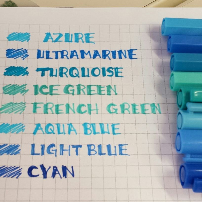
The Blues. The first four from the top to the bottom are the Stabilos – you can tell cause the caps have no clips. The colors are reasonably named and pretty close by brand (particularly Ice Green and French Green), but notice Staedtler has nothing close to a turquoise.
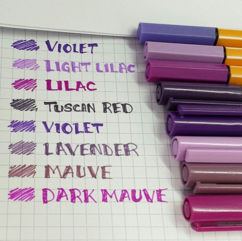
The Violets. Notice how the first three pens, the Stabilos, all are logically named and match their cap colors? Now, compare the remaining Staedtler pens. How is “dark mauve” LIGHTER than normal “mauve”, which has the darker cap? Why does “Lavender” have a light purple cap when it’s a dusky grayish Lilac color?? And don’t even get me started on the color that may or may not be “Tuscan Red”.
The Greens. Notice how Staedtler’s “Lime Green” and “Willow Green” are nearly the same green? And look nothing like their caps? Whereas there is a noticeable difference between Stabilo’s “Leaf green” and “Apple Green” (another favorite of mine) – AND the color matches the caps!

The Reds. When it comes to reds, Staedtler offers more options over the Stabilos. BUT… the cap vs color discrepancy strikes yet again. Does “Carmine” match the cap? What reasonable use would ANYONE ever have for “Light Carmine”!? It’s practically white for pete’s sake. I do like” Bordeaux” though, a nice rose pink.

The Orange/Yellows. First 4 pictured from top to bottom are Stabilos, second 4 are Staedtlers. I’m torn as to which I prefer or find more useful, the Stabilo Apricot, or the Staedtler Peach. Otherwise both brands are pretty similar.

The Dark Blues. I really like all of these. The first two are Stabilos, the other two Staedtlers. Night Blue and Delft Blue are some of my go-to favorites.

The Extras: Browns and Dark Greens. I really like Stabilo’s Pine Green. There is one more olive green in the Staedtler set, but I lent it to the hubby.

And finally, the Blacks/Grays. Notice the big differences in the mid and light gray tones!

Tagged: Color Chart, Stabilo, Stabilo 88, Staedtler Triplus Fineliner

hi there, love the review and swatches of all the colors, the only thing is, some of your comments on the colors were a little off. it sounds like you might have a red-green color deficiency. ask your eye doctor about it
Thanks for the comment Alex. I don’t have a red-green deficiency, but appreciate your concern.
Thank you for this! I have all of the Staedtler pens and was wondering whether it was worth getting the Stabilos. Looking at some of the colour differences, I have made up my mind!
Stabilo released neon colours too and in my opinion stabilo 88 pens colour quality is better !
this is amazing, thank you!
Exactly what I needed to read! thank you. Was thinking of getting the complete Staedtler set next to my colour pencils but this makes me reconsider and prefer the Stabilos.. Especially the turquoise comment!! thank you.
If it isn’t too late, I’d like to ask a question.
On the Stabilo 88 Markers, can you tell me what set you have?
Or did you buy them individually?
I loved the color comparison chart you made and thank you for it, it helped me make my mind up on markers for all of the Adult Coloring books I received for Yule.
I was going to buy a 30 marker set on Amazon, but I saw there were sets on the site as well.
Which is why I thought I had better ask you before I order.
Thank you for any help you can give me.
I’m torn between both because I own both complete set of pens including the neons and they both look great. There are a few odd balls among both set but they look pretty cool to me.
Too bad, most of the pictures are not visible on my Samsung(Android) tablet.
A small amount of my own blog audience possess complained regarding the website not working correctly in Explorer although seems to be fantastic inside Firefox. Have just about any tricks to guide fix this issue?
Hi Rudduck – I believe this has been corrected, it should show the images correctly now. Thanks for the note!